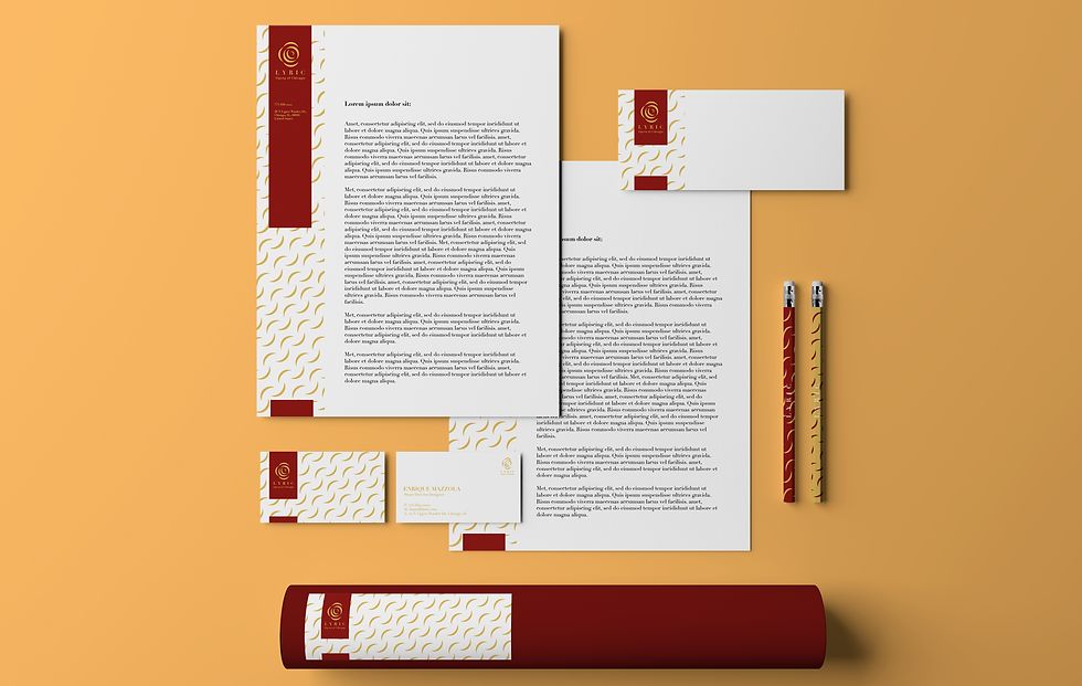
LYRIC Opera of Chicago
Identity system designed for Lyric Opera of Chicago. Aim to understand the organization and its context; to become knowledgeable about its history, its graphic identity, the identity systems of similar institutions; and, most importantly, develop a collection of images and words/phrases that will serve as a conceptual basis—a rationale—for the visual identity system.
Year
2021
Category
Logo Redesign, Identity System, Prototype


Design Preview
Background
Lyric is an old opera theatre in Chicago downtown area since 1954.
Lyric is redefining what it means to experience great opera today. Aim to express and promote the life-changing, trans formational, revelatory power of great opera, and to provide a broad, deep, and relevant cultural service to Chicago and the nation, and to advance the development of the art form.
The original logo is easy to recognize and remember as the logo of Lyric opera of Chicago since it only has its name in italic in a serif font. But it lacks opera or theatre elements in the logo, and it also not interesting enough to be seen as an opera house logo that opera performances are usually dramatic, strong and powerful to audience.
Tools
Adobe Illustrator, Photoshop, InDesign,
Procreate on iPad
Timeline
4 weeks

Mockup

Design
Initial sketches


Full research document
Visual Research

Full research document
Final Logo
.png)


.png)
.png)
